
Brand Identity, Logo, Brand Collateral
SERVICES
IDENTITY IN TRANSITION
After years of working as a video editor, Carlos was evolving into a video editing specialist, but his visual identity still reflected who he used to be. I developed a new identity that gave his work a more intentional, perceptive, and adaptable visual language while creating the tools he needed to communicate where he was going next.
BUILT FROM THE WORK
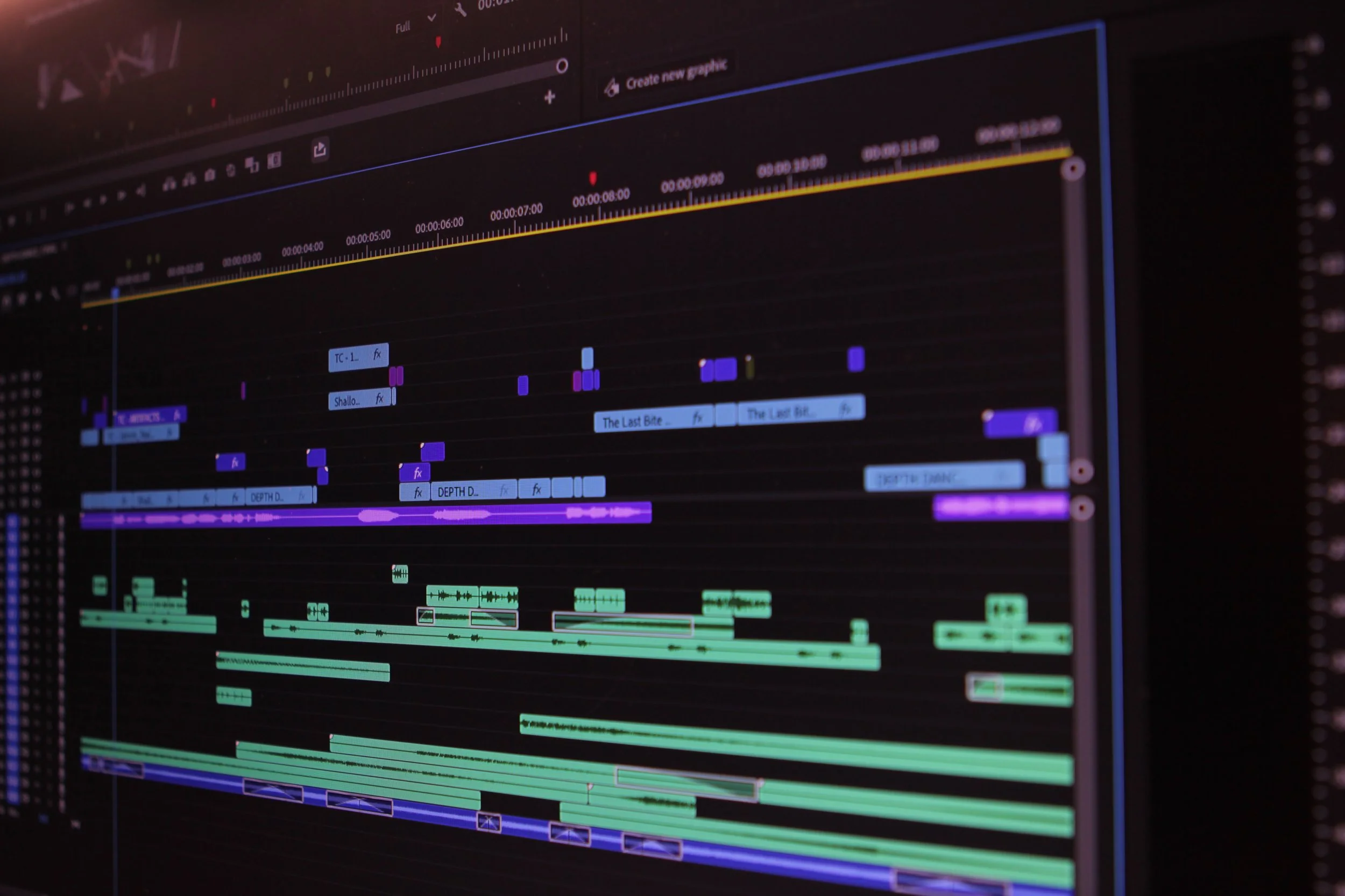
I began translating those ideas into visual territory, first creating a broad visual moodboard before exploring more focused directions. One of those directions was built around grids, using structure as a foundation for creative expression. Carlos saw something I hadn’t initially intended: the shapes reminded him of clips on a video editing timeline. Rather than forcing the original concept, we followed that observation and developed it into the foundation of the identity. The result was a visual language that felt organized and precise while remaining directly connected to the work Carlos does.
FINDING THE DIRECTION
Carlos came to me at a point of transition. His skills, perspective, and approach to video had evolved, but his visual identity hadn’t evolved with him. Before designing anything, I wanted to understand what had actually changed, not just what he wanted the brand to look like. Through conversations about his work, values, and ambitions, we identified five qualities at the core of the new brand: intentional, perceptive, restrained, adaptable, and creative.
THE LOGO
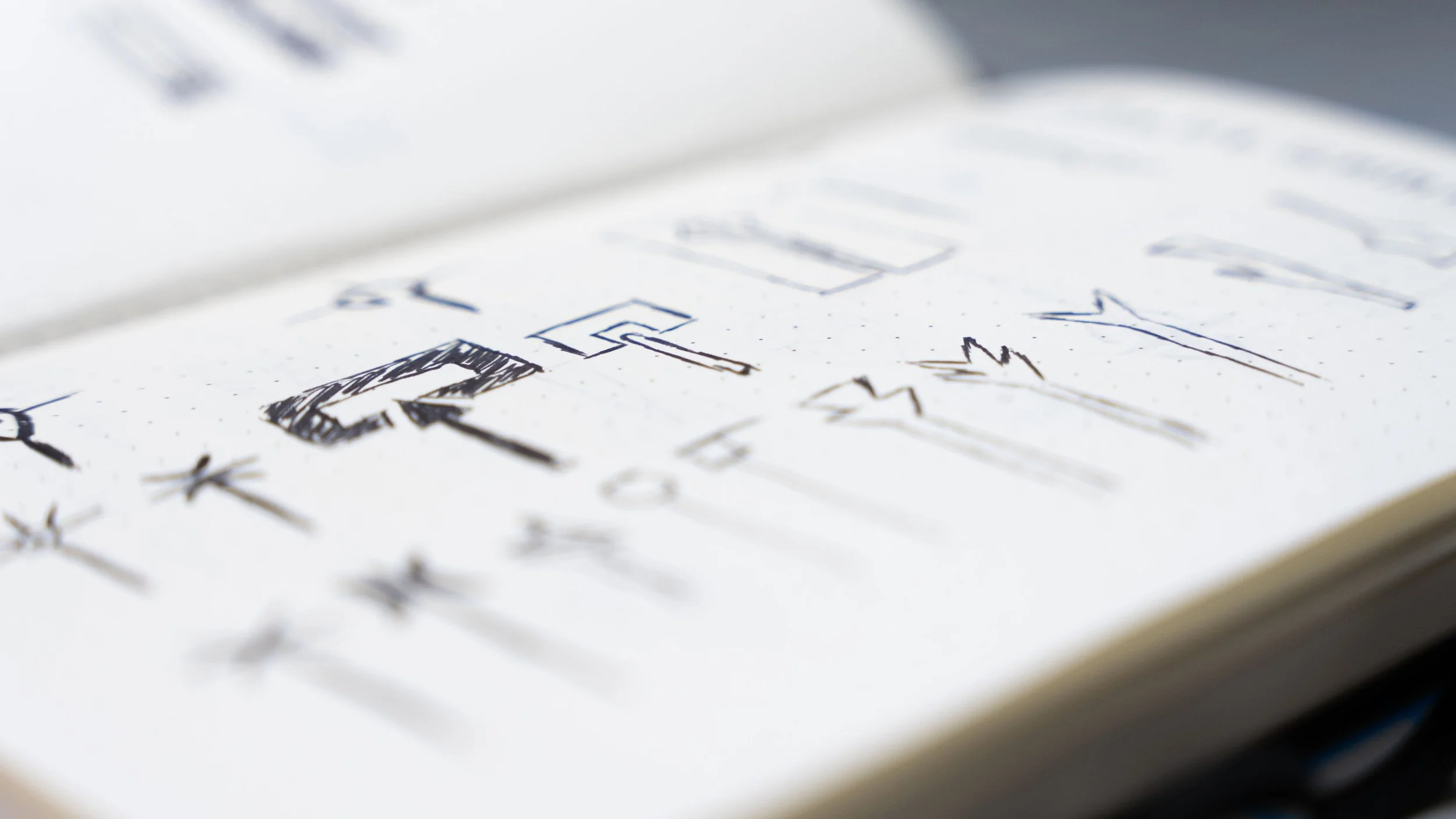
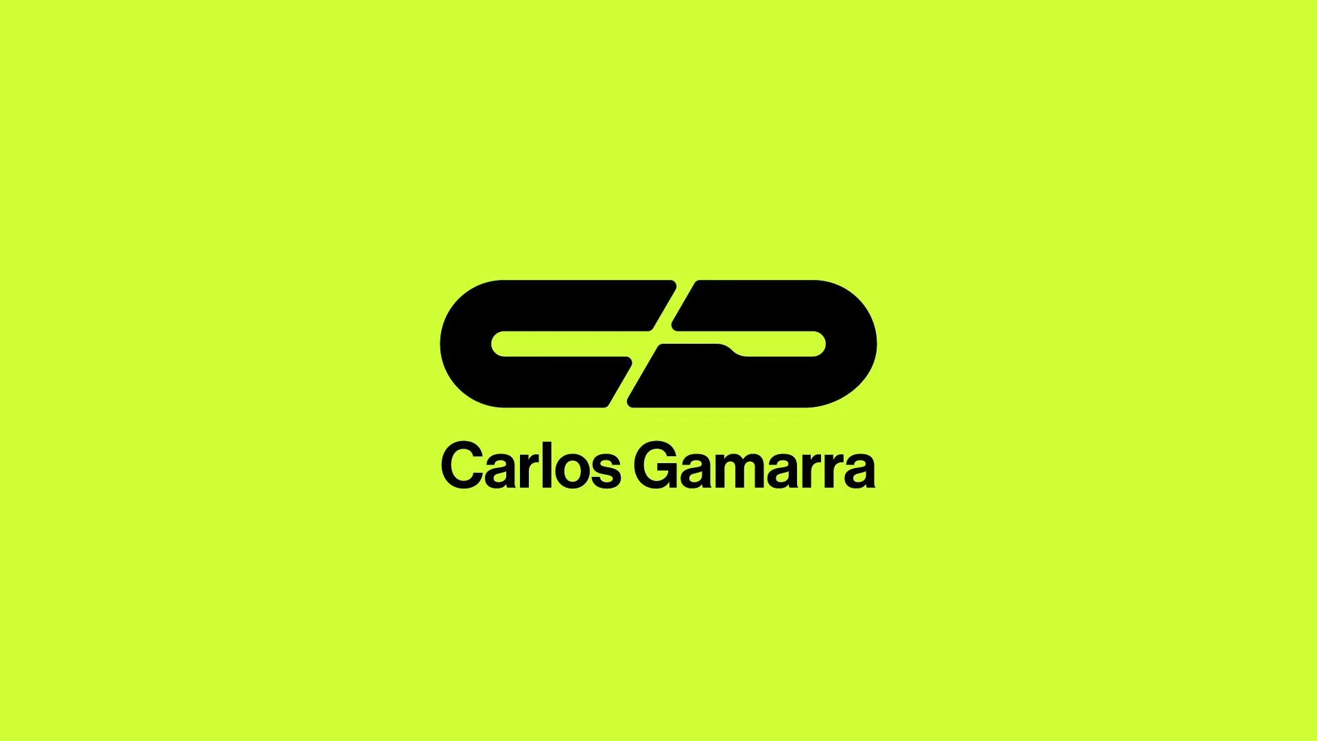
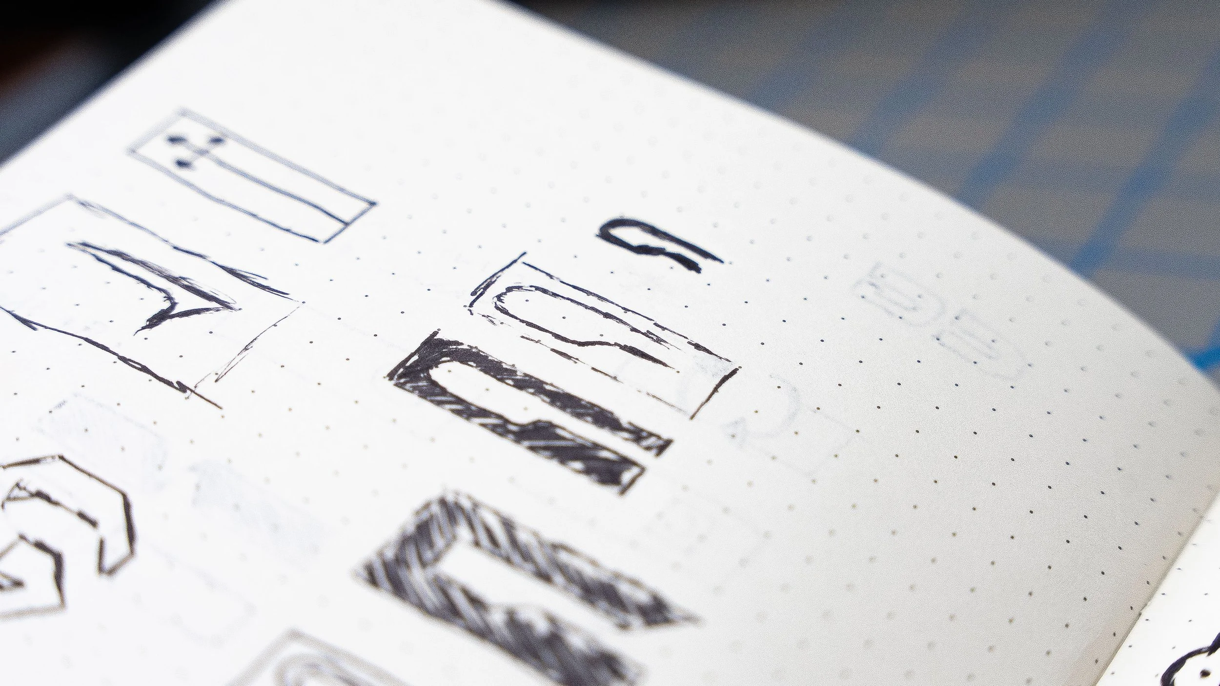
I explored many options, but upon presenting them, there was only one that truly stood out to Carlos. After another round of small edits, we managed to create a logo that not only felt right, it also worked perfectly with the brand that we were continuing to build.
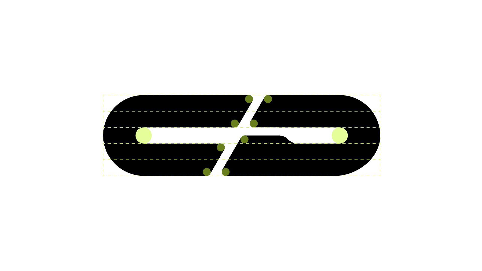
A lot of time was spent making sure the logo was as precise as possible. Everything was made proportionate to one another, ensuring the entire logo felt cohesive. But precision doesn’t ensure that things will look correct. For instance, the diagonal cut between the ‘C’ and ‘G’ has to be adjusted to make the logo feel balanced. If they were both equal lengths, one side would be longer or shorter than the other.